Sunday, April 26, 2015
Post 5 continued: Mise En Scène & The Visual Themes of Wes Anderson
Thought some of you would like to see this! Ties in nicely with some of the things I've been posting about.
Post 5: The Use of Cameras
Corrigan and White believe that ‘the shot is the visual heart of the cinema’ (p.105) and Wes Anderson stays true to this statement as he uses numerous camera shots and angles to create a dynamic and interactive film. Moonrise Kingdom is a movie about love, childhood and discovery, and all these aspects and more are emphasised with camera shots, such as close-ups, long shots and traveling shots.
An establishing shot depicts the setting where Sam and Suzy first meet, the poster of the ‘Summer Pageant’ at ‘St Jack’s Church’ in 1964. A low angle shot of an actor in a play then zooms out and helps to set the scene as we see the stage and the audience. A pan shot is used by Anderson to show all the boy scouts sitting and watching the play, before it finally pauses on one of the main characters, Sam. A traveling shot then follows Sam as he walks out of the building giving the viewers the feeling that they are physically behind Sam as he walks. Additionally it creates an atmosphere that involves movement and energy and this allows Wes Anderson to create a happy and lively mood despite when the story makes viewers feel miserable and emotional.

Another instance where camera shots are very effective is when Sam and Suzy reach the cove on the other side of the island, they bond while they swim, dance and eventually kiss. An over-the-shoulder shot offers a perspective from Sam’s mind to the features of Suzy as they both declare their love for each other. The scene progresses as a long shot is used to show the beach, the sea and Suzy setting up the record player. The two young lovers then walk hand in hand to the middle of the shot where they start dancing. Corrigan and White say that long shots are used ‘to emphasise isolation’ (p.110), and in this scene that is very much so. Sam and Suzy are caught up in their own world at the cove, with nothing to disturb them apart from the sea and the music… perfect isolation. The camera zooms up on the two and changes to a medium shot showing Sam and Suzy with their arms around each other, still slowly dancing and eventually Sam kissing Suzy. As the scene continues, a jump cut shows two close-ups of each character. ‘Close-ups show details of a person or an object… perhaps indicating nuances of the characters feelings or thoughts or suggesting the special significance of the object’ (p.105 - Corrigan and White) and in this case, the close up shows the special significance of Sam and Suzy and what their kiss meant. There is love, discovery and adventure in such a small act. A medium shot then follows and again Corrigan and White state that ‘romantic films about personal relationships often feature a predominance of medium close ups and medium shots to capture the facial expressions of the character’ (p.111). The relationship between the two young people is the primary story in this film and as viewers, being able to capture the looks and the expressions just brings us deeper into the story and heightens our relationship with the characters.


Works Cited:
Corrigan, Timothy and Patricia White. The Film Experience: An Introduction. Third Edition. New York: Bedford/St Martin’s, 2012. Print.
Thursday, April 23, 2015
Post 4 continued: Wes Anderson | Symmetry Disease
Just found this video to go with my previous post. As many people have discovered, Wes Anderson suffers greatly from symmetry disease, it cannot be helped (so we hope) - check out a short video of some of Anderson's finest symmetrical shots here!
Post 4: Symmetry
Symmetry is a key aspect in any of Wes Anderson films, but one film I found it most prominent in is The Royal Tenenbaums. The technique, although considered by many film experts to be amateur and ineffective, Anderson uses it to his advantage to create an appealing and dynamic shot. Humans typically gravitate towards and appreciate things with symmetry, so Anderson uses this aesthetic to frame and focalise the most important thing in his shot. This can be seen at the start of the movie when Royal Tenenbaum is telling his children that he is leaving the household. A mid-shot shows that he is the centre of the frame, with a chandelier hanging above him, seats neatly aligned on either side of him and lights on the wall placed symmetrically above his head. Now this in turn provides viewers with a sense of irony, as the characters throughout The Royal Tenenbaum's are anything but centred or symmetrical. They are dysfunctional, with harboured feelings and multi-faceted opinions and characteristics. Whilst the scene displays aspects of harmony and congruity the content we are watching is screaming separation and division. And in spite of the fact that symmetrical shots have the danger of being artificial and forced, Wes Anderson simply uses them to bring his art through cinema, to life.


Another film I saw a lot of symmetry in was the previously mentioned Fantastic Mr Fox. However I found that the majority of noticeable symmetrical shots were in the close ups of individual characters. The symmetry used in these particular circumstances seemed to highlight the theme of identity and almost give the readers that extra reminder that we are in fact dealing with animals. For example when Mr Fox is looking at buying the tree and he speaks to his lawyer, Badger. They begin by speaking reasonably but when Mr Fox accuses Badger of cussing at him, they turn from a civilised discussion to animalistic and instinctive. This is portrayed by an extreme close up of Mr Fox with his teeth bared and his claws ready that jump-cuts to Badger doing the same thing (these could arguably be seen as point-of-view shots for each character). They almost immediately sit down, once again civilised and talking normally. There is the constant tug between Mr Fox’s animalistic instincts and the moral standards he sets for himself and the others around him. Whether it be Mr Fox, Badger or Kylie, these shots got up close and personal, emphasising heavily the artistic value of symmetry.


Not only does Anderson use symmetry to produce a clear, focalised and aesthetically pleasing image, but he also does it to relay a deeper meaning, whether is it the symmetrical dysfunction of the Tenenbaum’s family separation or the theme of identity in Fantastic Mr Fox. It has almost become a signature move of Anderson’s, and I can almost guarantee that you will see aspects of symmetry in many other films produced by this auteur.
Wednesday, April 22, 2015
Post 2 & 3: Colours and Framing
The Grand Budapest Hotel is a superb film highlighting the ideas of nostalgia and family. The cinematography throughout the film is breathtaking. Corrigan and White state that ‘colour profoundly affects our experience and understanding of a film shot’ (p.114) and the use of colour in this particular film of Anderson's is used to immerse viewers into the world the characters occupy in the different time periods presented. The awards season blog of the New York Times, Carpetbagger, reveals that Mr Yeoman (the cinematographer) also said that Anderson “wanted to visually represent the different time periods with the different formats.”


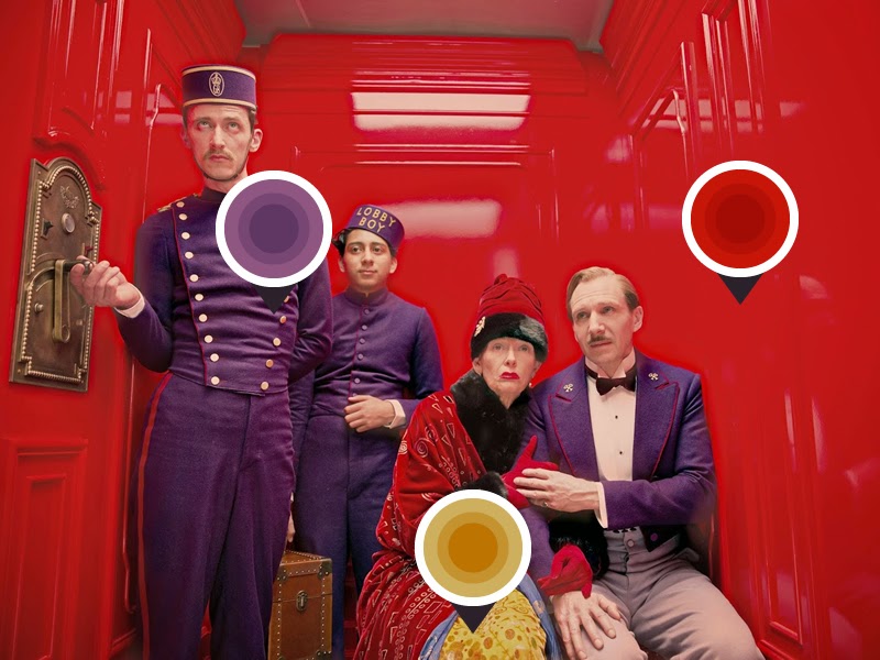
In the 1930’s (shot in a 4:3 aspect ratio), when the hotel is it at its prime, the colours are rich and bold. The uniforms of the hotel staff are a deep purple and this is complimented by the bright red carpets, suggesting a grandeur and lavish splendour about the hotel. An example of this can be seen when a mid-shot of Monsieur Gustave, Zero, Madame D and the doorman are in the elevator. The three men are wearing their purple uniforms, contrasting with the bright red of the elevator walls and furthermore the coat and hat of Madame D. To offset and compliment this assembly of colours, Madame D wears a gold skirt with orange patterns. The fact that Madame D is wearing red highlights her wealth and prosperity as it does with the hotel.
The Architectural Digest website has states that production designer Adam Stockhausen says that ‘the space reflects (Monsieur Gustave) through its colour palette and style. We wanted the entire structure of the hotel to feel like an integrated whole with the storytelling. It was a big challenge, and a very large and complicated set.” The walls of the hotel are a pastel pink, bright and saturated - highlighting the colours used at the time. Another example can be seen when a wide-shot depicts a group of children having a birthday party in the mint room of the hotel. The neatly stacked presents in the centre of the table, the various coloured birthday hats sat on the plates, along with the costumes of the children around the table, all have pastel colours that compliment the mint coloured walls and accentuate the colour palette that was central during the 1930’s.
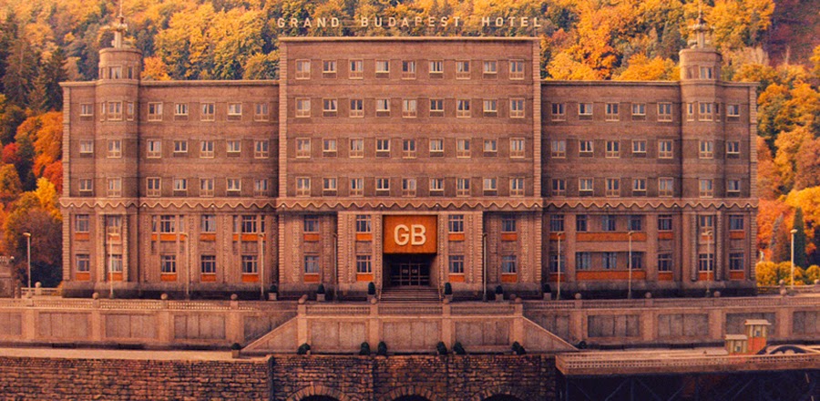
If we go forward into the late 1960's (shot in a 2.35:1 ratio with anamorphic lenses), we see washed out oranges and olive greens. There are yellows, browns and golds representing the type of natural 'nature' colours commonly used throughout the late 1960's. The establishing shot that shows viewers the hotel, highlights the dark browns and golds seen in the brick. This is set off by the various shades of oranges seen on the leaves of the trees. These colours emphasise the fact that the story was set during the communist period and also suggest the repression and fascism that occurred.
Lastly we see the colours surrounding the period of the 1980's (shot in a 1.85:1 format). A relatively neutral cine-type palette is used, with nothing too saturated or overly fancy. It is simple and pretty colours used. Examples of this can be seen at the beginning of the movie when a young girl visits the statue of the author of the book 'The Grand Budapest Hotel', there is a close up of the book she is holding and it is a reflection of the pastel pinks associated with the hotel in the 1930's. However the ground beneath her is a neutral sand colour and her hands and coat are in the same palette.

Fantastic Mr Fox uses colours in a very different way, to produce a very different response. Although there is not a specific time period associated with the film, unlike The Grand Budapest Hotel, viewers can take note of the colours and patterns (through costume and interior design as well) used and derive from it a judgement, including music, dialogue and setting amongst other things, that for me screamed 1970's.
The film's colour palette focuses almost entirely on autumn hues - oranges, reds, browns and golds to name just a few. However this limited range of hues allows viewers to focus a lot more of the textures and materials of other things. A monochromatic colour scheme can ‘create a more realistic or flat background against which a single colour becomes more meaningful… which can create dramatic oppositions and tensions through colour’ (Corrigan and White, p.116). The sets and puppet's tactile qualities are greatly enhanced, as it contrasts with the autumn colours. Actual material is used in the filming of this movie, for example fur (and goats hair!) was used on the puppets of the foxes, Mr Fox’s suit was made out of real corduroy, and his jumper was hand knitted! This in turn bought an aspect of realism to the stop-motion film that arguably could not have been achieved otherwise. (Watch this awesome video here to see more on the making of the film.)


However despite the almost explicit use of autumnal colours, there are aspects of neutral greys and blues to off-set the dominant colours. These colours are normally associated with the ‘human world’ and have more of an industrial feel, for example when the characters raid the supermarket or the Bean kitchen. They are also portrayed in a harsh, cold light in contrast to the warm hues linked to the golds and browns of the world of the foxes. A prime example of this can be seen when Mr. Fox, Kylie and Kristopherson sneak into Bean’s kitchen to steal some cider. A medium shot shows Mrs Bean walking down the stairs and turning the light on, this highlights the steely grey of the stairs and the walls. The diegetic sound of her echoing footsteps suggests trouble and reiterates her humanity. A cut shot to a close up of Mr Fox’s face accentuates the warm golden and orange hues of his fur - suggesting the stark contrast between the aspect of nature and wildness that surround him and the cold, hard industrial world that surrounds his enemies.

The very limited colour palette seen in this movie is different to that of The Grand Budapest Hotel, which uses its wide variety of colours to differentiate time periods and emotions. Yet it is something that works superbly and suggests to viewers an aspect of reality and an immersion into a very nature and family orientated world.
Works Cited:
Architectural Digest. Web. 21st April. http://www.architecturaldigest.com/blogs/daily/2014/03/grand-budapest-hotel-set-design-wes-anderson-slideshow_slideshow_item3_4
The Carpetbagger. Web. 21st April. http://carpetbagger.blogs.nytimes.com/2015/01/21/below-the-line-shooting-the-grand-budapest-hotel/?_r=0
Corrigan, Timothy and Patricia White. The Film Experience: An Introduction. Third Edition. New York: Bedford/St Martin's, 2012. Print.
Tuesday, April 21, 2015
Post 1: Hello!
What is not to love about Wes Anderson?
The director, writer and producer has created films that many only hope to achieve. He is a multiple Academy Award nominee and moreover, the rare talent has received an Academy Award for Best Director and the Golden Globe Award for Best Motion Picture... and on top of all that he received the BAFTA Award for Best Original Screenplay in 2015.
So what is it that makes Wes Anderson so great, apart from all the awards brilliantly presented under his belt? Some might say that it is his stories within his films and the themes they include. Many of his films focus on a swiftly moving comedy, with aspects of drama and melancholy elements. Themes arise that focus on family and institutions, unlikely friendships and nostalgia. There is ties of deception and theft, accompanied thoroughly by adventure.
But for me, it is solely his love of film-making that allows him to be crowned with a title of greatness. His use of cinematography and mise-en-scène develops and produces such stunning works of art. His films are constantly marked with colourful compositions and signature camera moves. He puts a great deal of emphasis on things such as formalism, including textures and materials, shapes, lines and patterns. Anderson's attention to detail, whether it be colour or symmetry, costumes or shots, enhances and enriches his films - making him, in my opinion, one of the best directors of all time and consequently one of cinema's greatest auteurs.
So finally, welcome to my blog, Wes Anderson's Wonderful World. I will be watching some of Anderson’s films and talking about his use of cinematography and mise-en-scène (in my chosen favourites) and what it means to us as viewers. Keep checking back for updates and enjoy your time here.

Subscribe to:
Posts (Atom)